A strong and clear brand for a local tradie
Worbone Pty Ltd.

Project Brief
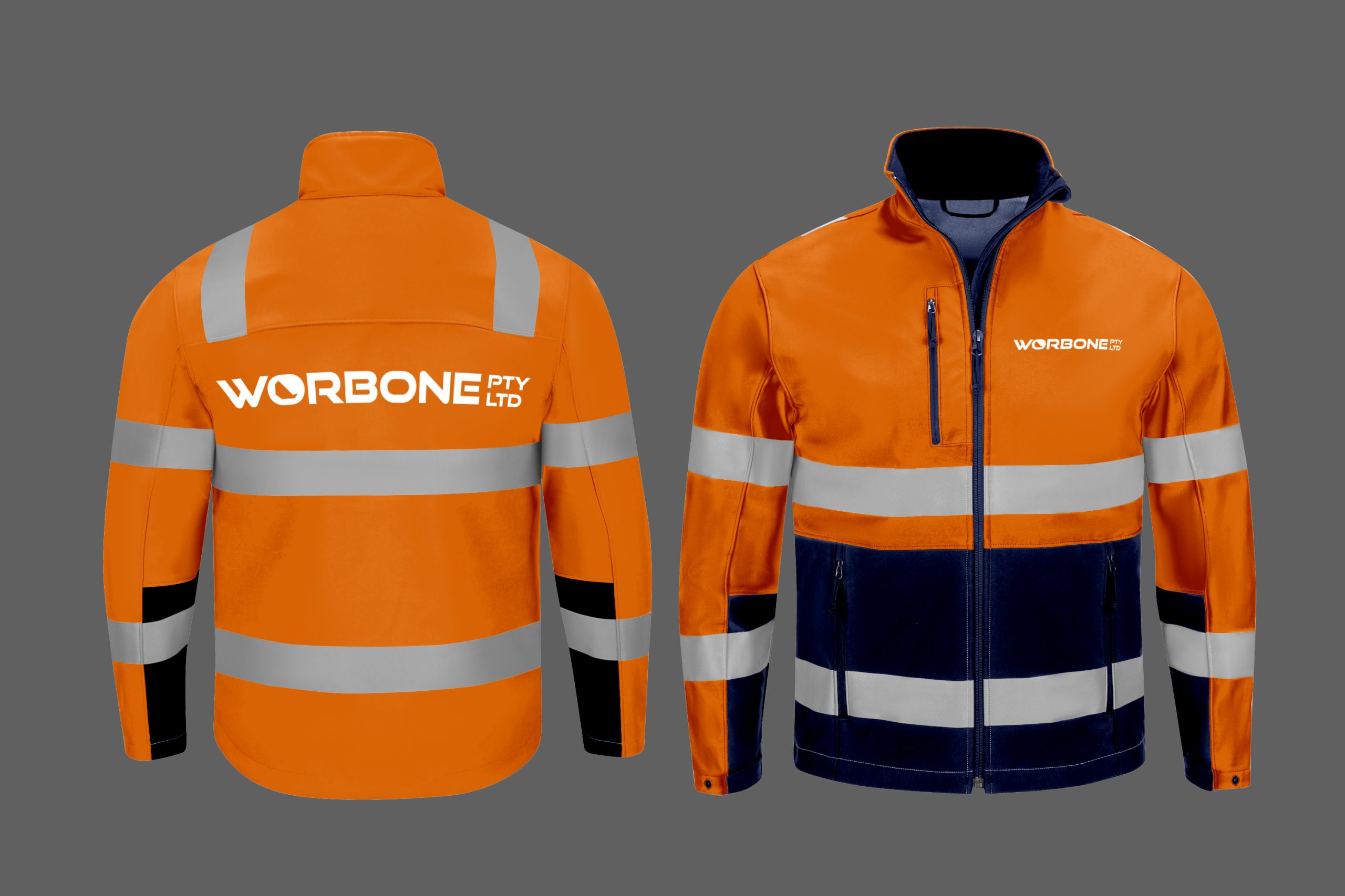
A local, down-to-earth contractor reached out for a complete branding package to enhance his business presence. He needed a distinctive logo and comprehensive branded signage for his equipment. The project deliverables included:
- A unique and professional logo
- A brand guideline document to ensure consistency and correct usage across all platforms
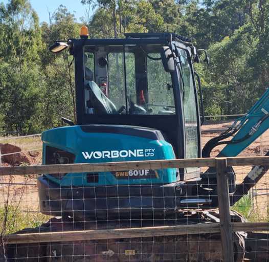
- Branded signage for his equipment
- A promotional flyer to attract new clients and showcase his services
This cohesive branding effort aimed
to solidify his business identity and
make a lasting impression on
potential customers.
Concept Development
The concept development process for the logo drew inspiration from well-known construction brands such as JCB, CAT, and Komatsu. These brands are recognised for their bold, iconic design that convey strength and reliability.
Outcome
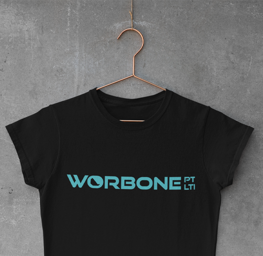
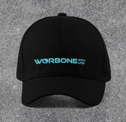
The result is a strong and visually impactful logo featuring subtle design elements that represent the core of the construction industry. This new logo not only captures the contractor’s brand identity but also ensures it stands out in a competitive market, much like the iconic brands that inspired it.
Out in the wild


